
DSight: A smarter way to organize doctors, manage information, and keep track of every visit.
DoctorFlow brings doctor management and patient visit tracking into one accessible mobile app. The experience simplifies finding a doctor, accessing contact details, reviewing visit history, and maintaining a personal doctor list.

Project Overview
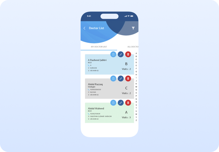
DoctorFlow is a healthcare-focused mobile application designed to make doctor management and patient visit tracking simple, organized, and accessible. The Doctor List screen provides users with a clear overview of their saved doctors, essential contact information, locations, and visit history.
The goal is to transform scattered doctor information into a clear, structured and measurable mobile experience. By combining a centralized doctor directory, personal lists, visit tracking, and quick actions, the app creates a management journey designed around efficiency and clarity.

02 — UX strategy
A healthcare experience built for clarity and speed
The system organizes doctor information into one place, makes contact details easy to access, supports quick actions, and helps users track visit history without unnecessary navigation.
One connected doctor directory
Users move through a simple cycle: Find → View → Manage. The app combines a centralized directory with personal lists, visit tracking, and quick actions, creating a continuous management experience rather than treating browsing and record-keeping as separate tasks.
Clear information hierarchy
Prominent doctor cards, easy-to-read typography, clear visit counts, and accessible action buttons make the interface feel organized without becoming overwhelming.
Personalized healthcare companion
Surface relevant doctors based on visit history, saved favorites, and quick actions: View contact details, review visit history, edit records, and manage doctor lists with minimal steps.
03 — Experience architecture
A journey built in practical healthcare moments
Each part of the experience has one job: locate a doctor, review essential information, or perform a quick action.
1
Discover: Find a doctor quickly
Users can browse the doctor directory, use alphabetical navigation, and access saved favorites with minimal friction.
2
View: Review essential doctor details
Doctor information cards display name, specialty, phone number, location, and visit count in one easy-to-scan place.
3
Track: Monitor visit history
Visit counts and history help users understand activity and follow-up patterns at a glance.
4
Manage: Edit or remove doctor records
Quick actions allow users to update or remove doctor records directly from the list without extra navigation.
5
Navigate: Use alphabetical indexing
An A–Z index provides a faster way to navigate a larger doctor directory and locate specific records.
6
Organize: Keep personal lists separate
The app separates personal favorites from the broader directory, making frequently visited doctors easy to find.
04 — The experience
One system, three modes of healthcare discovery
Editorial storytelling, structured browsing, and mobile continuity work together without losing the calm healthcare tone.
Responsive continuity
Keep the healthcare story intact on smaller screens
The mobile expression preserves the same hierarchy and visual pace rather than compressing the desktop layout. Cards remain generous, actions stay reachable, and each screen keeps one clear focus.
- Responsive rules protect reading rhythm, not only component size.
05 — Design outcomes
What the design establishes
The outcome is expressed through the product qualities visible in the finished system: clarity, accessibility, and a distinctive healthcare voice.
A clearer doctor discovery path
Users can enter through directory, favorites, or search while remaining oriented inside one consistent healthcare system.
Healthcare depth that scales
Reusable doctor cards support rich medical information without making every screen feel mechanically identical.
Responsive by intention
The mobile hierarchy is designed around reading, scanning, and quick actions rather than treated as a reduced desktop view.
A distinct healthcare tone
The combination of blue accents, clean cards, and friendly type gives the app a recognizable yet functional healthcare expression.
Clarity only works when structure is strong
Minimal healthcare interfaces can become vague when they remove too much guidance. DoctorFlow’s clarity comes from clear information architecture, recognizable patterns, and deliberate contrast—not from absence. The system earns its calmness by making the underlying choices easy to understand.
What carries the experience
- Story-led entry points make exploration feel purposeful.
- A restrained palette gives imagery room to create emotion.
- Consistent metadata makes rich content easier to scan.
- Responsive rules preserve pace as well as layout.